Symbolism in Art: Red

In Matisse’s Music, created in 1910 to be hung in the staircase of a Moscow mansion, we see one of the artist’s last compositions of the human figure. It was created to be hung alongside a second, preceding painting titled Dance. The two works are colouristically linked, portraying red figures contrasted against a blue and green background.

Born in France in 1869, Henri Matisse was at the forefront of the Fauvism movement and would go on to become one of the greatest painters of the twentieth century. His work moved away from the Impressionist paintings that had surrounded him in his youth and focussed on the use of deep, bold colour. His subjects, often human, stand out against strong blocks of brilliant colour. Observing Matisse’s work with a modern-day eye, it’s difficult to imagine the level of originality captured in these striking, stark figures.
In 1905, visitors to the annual Salon d’Automne expressed deep shock when confronted with Fauvist paintings. One critic commented that the people behind these paintings must be “wild beasts”.
The work of the movement was known for capturing strong, expressive reactions to the subjects portrayed, but Matisse himself claimed to be captivated by the idea of creating work that was pleasing to the viewer. He stated that he sought to create art that had “a soothing, calming influence on the mind, rather like a good armchair.”
In Matisse’s Music, created in 1910 to be hung in the staircase of a Moscow mansion, we see one of the artist’s last compositions of the human figure. It was created to be hung alongside a second, preceding painting titled Dance. The two works are colouristically linked, portraying red figures contrasted against a blue and green background.
The figures are simplistic, rough, rounded outlines on a fluid background (with the possible exception of the violinist, who appears rigid and taught as he stands to play his instrument). All 5 of the figures are coloured with a bold, primary red. Often thought to be the most emotionally charged colour, red tones carry heavy symbolism and meaning.
One of the boldest colours in the spectrum, red stands out in any work of art, hence it’s use to signal danger or warning. Red is used to contrast with its surroundings, drawing the viewer’s attention. Red is the colour of stoplights, fire hydrants and warning signs.
But it is not a colour that is alien to the human form. Our own blood is red, making the colour at once other and instantly familiar and heightening our association with danger, fear and intensity – often established in early childhood with our first cut or injury.
In Music the evocative red colourings of the figures serve to increase their otherness - their base, primitive nature. The drawings themselves are reminiscent of early hieroglyphs or cave paintings and their primary colouring lends them a contradictory nature. They are at once simple, primary and rough and at the same time evocative, energetic and charged. Music in this image, seems to take the figures back to their essential nature.
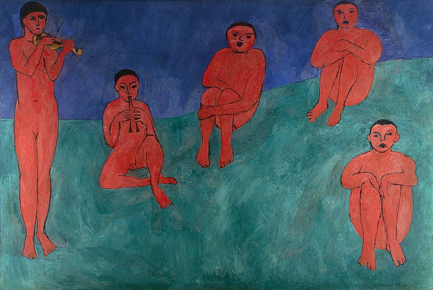
Henri Matisse, Music, 1920. 260 x 389 cm. Current location: State Hermitage Museum, Saint Petersburg, Russia
Matisse’s figures are largely still, waiting, watching as the violinist and piper play. Their deep red colouring contrasts with their calm demeanour, symbolically reminding us of heat, rage, anger, longing and vigour. When lighter tones of red are introduced they seem to speak more of love and femininity, but these simple figures, staring out at us from the canvas, feel masculine. Indeed, their genitalia was painted over during one of several adjustments made by the artist during composition. Their outer stillness seems to contradict them. They have climbed to the top of a hill and wrapped themselves in music, in total concentration for art, and their essential, animal nature is alive with the creativity.